


Visualizing Employment by Law School
This post has been viewed 2,398 times.
We looked at the schools in the top 50 of the U.S. News 2014 rankings, and plotted the percentages of each school’s graduates in each of the ABA’s summary outcome categories. Higher values are indicated by blue, and lower values by orange or red (with grey in the middle). We also included a “dendrogram” at the top; this is a visual representation of how similar each of the categories are to each other, based on the distributions of their values across the different schools.
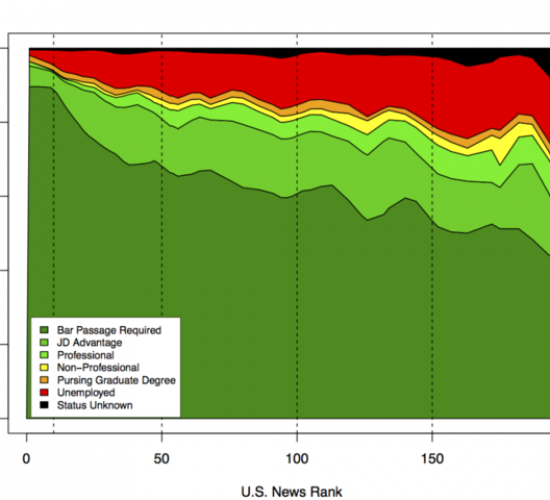
Returning to the ABA’s employment data for 2014, we can use a shaded area plot to see how the various employment outcomes vary as we move through the U.S. News rankings. Each shaded area represents the proportion of a school’s graduates who achieved a particular type of employment outcome, with the schools ordered by their 2014 U.S. News ranking.
Read original articleTags: